Development
We had an Illustration style for the hotel room posters created by the Indian design team that was going to be used globally and we had to create the UK version. We decided then to build the future visual identity for the company's internal and partner communications from this illustration.

So based on the examples of other countries, we added British elements and landmarks to make it authentically English.


It was time to define a colour palette based on the illustration and
bring the projects to life.
With the hero image and palette ready, we could now develop the illustration
into different projects.
Icons set
I created an icon set to be used in the marketing collaterals following the illustration style and colors we had for the hero illustration. These icons will be used to support and break the text content in the sales booklet
and presentation template.

Sales Booklet
The sales brochure was one of the most important pieces for Business Developers as the key product for them to explain the benefits of signing with OYO. I mixed colorful character illustrations with text to give a human touch and a more colorful result for
the heavy sales content.
Google Slides & E-mail template
These templates were important to save Business Developers' time and hassle and keep the communication always on-brand.
OYO Brand Guidelines
We created an OYO Brand Guidelines, focusing only in the UK market and explaining our Tone of Voice, Photography Style, Colour Pallete, Illustrations, Icons and Typography.
The Welcome Kit
The welcome kit was a box with an informative folder to help the hotelier to understand their future with OYO, a warm welcome letter written by the UK CEO, and of course, a few treats to delight the partner. It was a successful piece, very welcomed by the Bd's, and got fantastic feedback from the Hotel Owners.
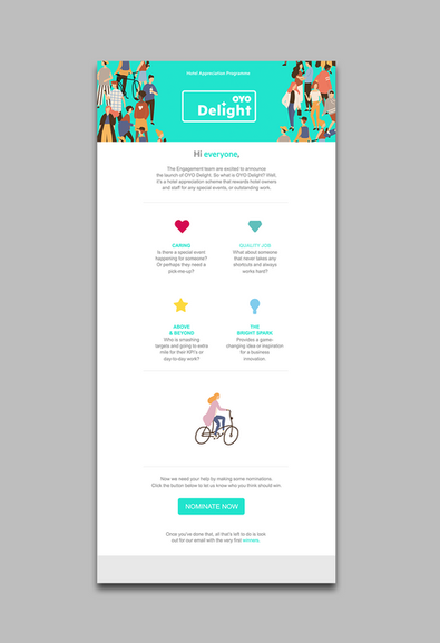
OYO Delight Project
Last but not least, the OYO Delight is a hotel appreciation initiative that recognizes the very best hotels, hotel owners, and hotel team members. The true stars! It's a chance to get to know and care about all the great things the hotel partners and their teams are up to. I created a postcard, email and a pattern for future applications.


